Swan Haus
welcome to
Explore
Stay in Touch
Sign up below to join the Katie & Co. Collective and receive tips and tricks straight to your inbox!
Led by founder Katie Mask, Swan Haus provides interior designers with elevated, strong, strategic brands so they can joyfully & efficiently build a lasting legacy.
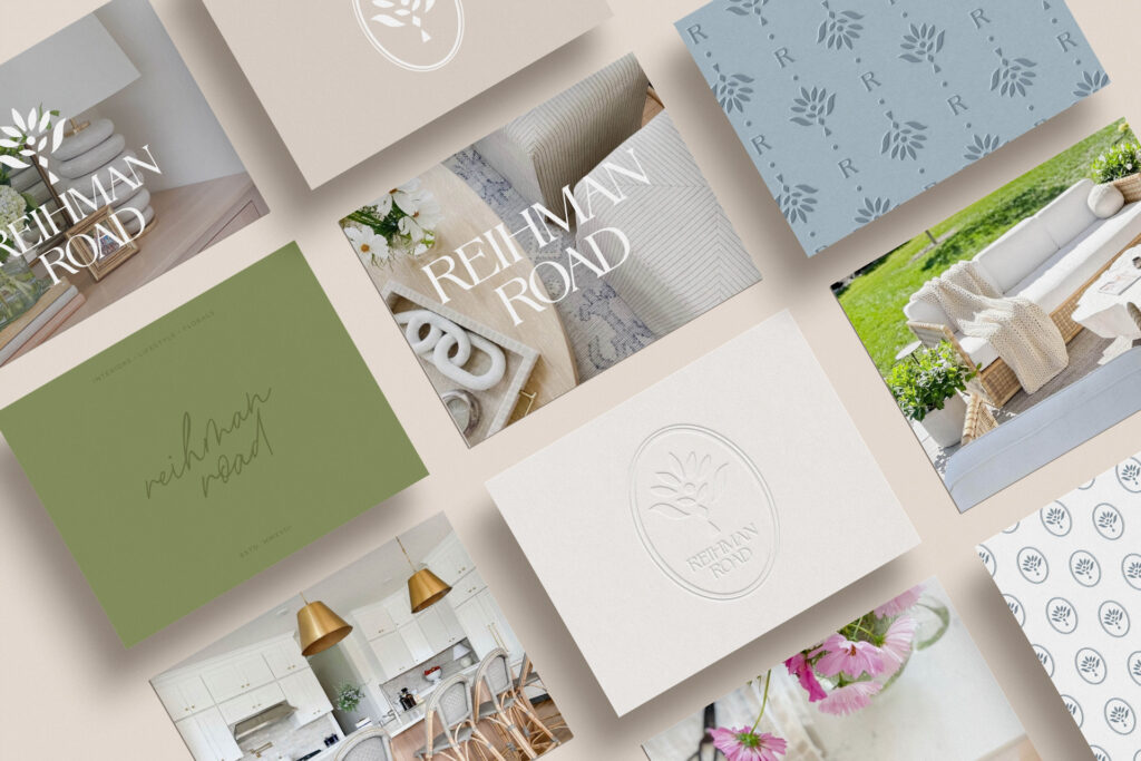
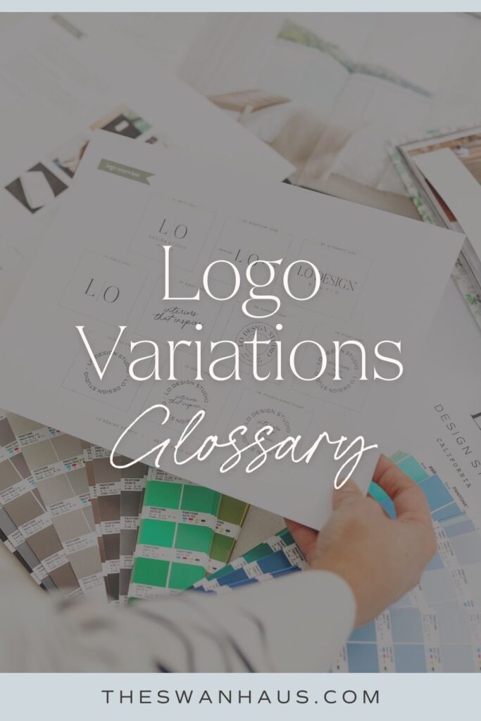
As a brand designer, one of the questions I get asked the most is, “Why do I need logo variations?” If you’ve wondered this before, then you’re not alone!
The reality of owning your business and the associated brand is that you are going to be using your logo A LOT. There’s websites, social media profiles, stationary, emails, thank you cards, t-shirts, bags, and the list goes on and on. Each situation will call for a different version of your logo. And when those various situations arrive, you want to have the perfect variation of your logo to pull out of your brand pocket.
As a business owner, you need to know which logo to use in which circumstances. So if you’ve ever questioned which logo variation to use, stay tuned! You’re about to become an expert on why you need logo variations and when to use them.
Primary Logo
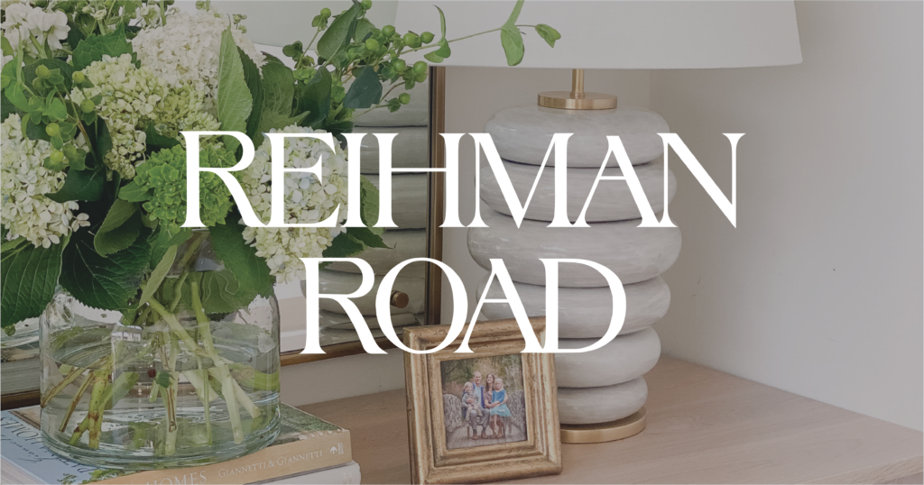
Your primary logo is your most used and most important branding asset. The star of the show! This will be your go-to logo and the one you reach for first. It will be the most recognizable logo in your brand suite. Your primary logo may contain details such as your full business name, tagline, byline, or the date your business was established.
I spend quite a bit of time talking to my clients about brand strategy, identity, mission, and values—all before ever creating a logo. Why? Because your primary logo has to embody all of that! All the colors, fonts, and illustrations in your logo must all be aligned to your brand identity. So why do I tell you all of this? I tell you to illustrate how important your primary logo is. When you take the necessary steps to create this logo, you are visually creating everything you want your business to be and represent.
Secondary Logo
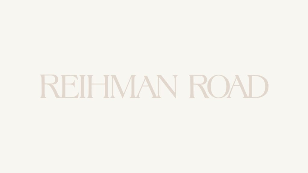
Think of your secondary logo as your primary logo’s sidekick. This logo will keep your brand identity (the color, font, symbol, line, weights, etc.) but will be arranged differently. In fact, that is the number one goal of your secondary logo.
For example, if your primary logo is arranged horizontally (short and wide), then your secondary logo will be formatted in a square format, and vice versa. This ensures that you have a dynamic and legible logo for instances with limited horizontal space or limited vertical space.
Consider this example: if your primary logo is wider than it is tall, it works beautifully on your website as it fills the space and allows more room for stunning photos or text. However, if you were to use the same wide logo as your social media profile image, in order to fit the entire logo, the text would need to be tiny and likely not easy to read or recognize. This classic example illustrates the need for logo variations – properly supplying your branding toolbelt and ensuring your brand looks professional in every scenario and first impression.
Alternate Logo
Your alternate logo is all about creativity! It is a playful, unique twist on your primary logo. This logo is created to showcase your brand personality, as well as add a variety of interest to your brand suite.
While your primary logo is specifically designed to be legible and recognizable, your alternate logo places more emphasis on interest and personality. Because of this, the alternate logo should be used as an enhancement or accessory of your brand and not used in “first look” instances. Rather, you should use your alternate logo in places where the viewer has already started building a relationship with your brand. Think of social media graphics, thank you cards, and website footers. These are the kinds of places where people will still recognize your logo and appreciate seeing a different side of your brand.

Submarks
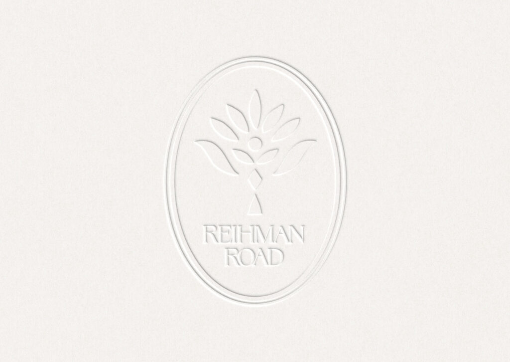
These are the tiny yet mighty versions of your logo. In other words, they are the shorthand of your brand. A brand submark can come in many different forms—a monogram (created from the initials of your company name), a stamp (a shape with your brand name, tagline, or other brand details around it), an icon (a simple visual representation of your brand and its aesthetic), or some sort of combination. Often a brand will have multiple submarks—any combination of the above!
Submarks are perfect to use when you have limited space, you want to put your logo on something small, or you want to add subtle branding elements to your collateral. Stickers or watermarks are excellent examples of this.
Coming Together
When you have multiple brand elements in your tool belt, your brand is not only recognizable, but versatile, interesting, and dynamic. You are prepared for every instance and have just the right logo for every situation. Brand designers don’t create multiple logo variations for their clients on a whim. They do so because it’s essential for a successful, standout business!
Your logo variations are meant to breathe life into your brand, provide visual options, and allow your brand visuals to stay fresh and relevant for years to come. But they will only accomplish this if you understand their importance and know how to use them. So if you’ve spent time making a brand suite or working with a brand designer, then don’t let them go to waste! Take the time to correctly and effectively use your different logo variations.
Have questions? Shoot us an email!
Check out more from the blog here.
Follow along for more business tips and tricks on Instagram!
Like this post? Save it on Pinterest!
hide —
Leave a Reply Cancel reply
Brand and Web Design for Interior Designers
©2019-2025 swan haus, llc | legal | site credits
The Swan Society
sign up for our email community
view comments +